ProsthEd Website Design
My Role: UX/UI, Wireframing, Prototyping
Tools: Adobe XD, Goodnotes
Timeline: October 2022 - November 2022

Background
The Problem
ProsthEd, a summit filled with guest speakers, networking, and educational opportunities to learn about prosthetic products on the market and how they are revolutionizing the industry, required an interactive, multi-page website. A major event being held in New York City, it was important that they had an easy to navigate website with clear guidance as to how to register for the event and find out more information.
Key Question
How can we create an easy to navigate, multi page website for users to learn about ProsthEd and register for the event?

The Process
Research
To begin, I researched standout web applications that apply the same goals as I was looking to execute: simple and intuitive web design. This included in-depth analysis of footer layouts, as well as looking at different wireframe layouts for event registration websites.
I then created a rough wireframe of each page's layout and potential content. In this space I sketched potential ways the images and text could flow together to introduce the event and registration site.
Once the wireframes and mockups were finalized, I moved on to creating the actual design of the website. I started with the color scheme and typography, which needed to be modern and professional while still being accessible. I chose a color palette that included shades of purple and white, which I felt reflected the feel for the event’s friendliness and innovation.

Next, I designed the homepage, which needed to make a strong first impression and encourage visitors to explore further. I used high-quality images of people using prosthetic products to create a sense of inclusivity and positivity. The homepage also featured a clear call-to-action button that directed visitors to the registration page.
The speakers page was designed to showcase the event's guest speakers and their credentials. I created a layout with photos of each speaker, along with their name and a brief bio. The goal of this page was to get people excited about the guest speakers and encourage them to attend.
The registration page needed to be simple and easy to use, with clear instructions on how to sign up for the event. There was a countdown ticker for seeing how long until the event was happening, and clear information listed about the event’s location.
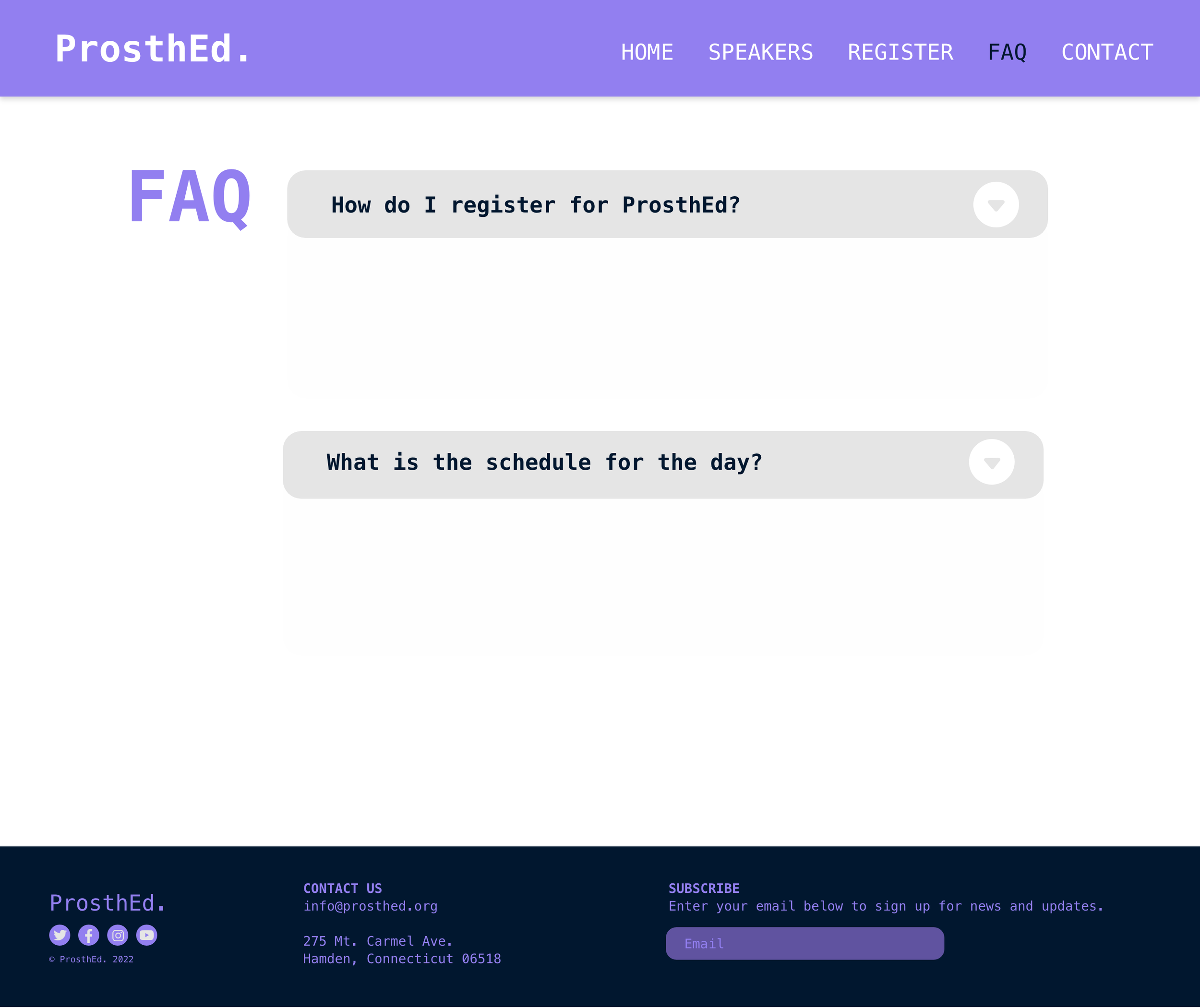
Finally, The FAQ page provided answers to common questions about the event, such as the location and schedule. I organized the questions into categories and used accordion-style tabs to make it easy for visitors to find the information they were looking for.


Interactive Elements
After finalizing all of the design elements of the project, it was time to move on to the interactive side of things. I continued in XD, adjusting the states of elements that I wanted to be interactive and have a change in visuals, such as the register button. I created states in which the button would protrude or change color when hovered or clicked. In addition, these changes were made in the menu bar and the FAQ page as well, adding drop-down menus and highlights to make it even more customized.
Conclusion
Impact
The ProsthEd website was designed to be informative, engaging, and easy to navigate. I used design thinking skills, my extensive knowledge of typography, and my visual design skills to put together an event site that creatively executed the client’s needs.
Conclusion
Impact
The ProsthEd website was designed to be informative, engaging, and easy to navigate. I used design thinking skills, my extensive knowledge of typography, and my visual design skills to put together an event site that creatively executed the client’s needs.
Challenges
Looking back on this project, there were a few challenges I encountered and some things I would do better next time:
Wireframing. For this project, I definitely lacked in the preliminary research and sketching. Next time, I would do much more research and mood boarding, as well as sketch a lot more ideas to help the creative juices flow.
Minimalism was an issue in this project for me. Overall, it was much simpler than I wanted it to be. I wish I had challenged myself more to make the site visually exciting.